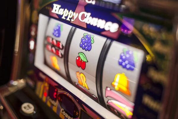


You open a game and notice the spin button before anything else. Symbols sit neatly in their frames, the balance stays visible, and a cluster of controls waits around the edges. Nothing feels accidental, even when you cannot explain why the screen feels easy to use. A modern slot interface is built around those tiny decisions, from button placement to the timing of a win animation.
The screen starts with hierarchy
Your eyes need somewhere to go first. Good design quietly decides that order before your hand touches the screen.


The spin button does the talking
A central spin control usually receives the strongest visual treatment because it carries the main action. Size, colour, contrast, and spacing tell you that this is where play begins.
Honestly, the best interfaces make this feel boring. You never hunt for it, yet you do not feel pushed.
Information stays nearby
Your balance, stake controls, paytable access, and autoplay settings need to remain easy to find. Designers often group related controls so the screen does not become a scattered collection of glowing objects.
If a slot interface hides the paytable behind several taps, the visual polish starts to feel less helpful. You need to understand the rules without breaking the flow of the session.
Movement has a job
Animation gives the interface personality, but motion also guides attention. Every flash, bounce, and transition asks your eyes to follow something.
Reels need readable motion
Reel movement has to feel lively without making symbols difficult to identify. Designers control speed, blur, stopping order, and the pause before a result settles. A winning line may brighten afterward, but the symbols still need to remain clear.
A near-win animation can feel dramatic because your eyes notice what almost happened. That is a design decision, not evidence that the next result is more likely. Weirdly enough, quieter motion can sometimes make a game feel more confident.
Sound and motion share the load
A muted session should still make sense visually. Audio can reinforce a feature trigger or payout, yet the screen must communicate the same change through colour, movement, or a visible counter. Otherwise, you may miss what happened while playing without sound.
Small details decide comfort
Once the main action works, designers focus on details that keep the screen from becoming tiring. These choices are easy to overlook until they go wrong.
Mobile spacing changes everything
Touch controls need enough room for a thumb, particularly when stake buttons sit near the spin control. Text must remain readable on a smaller display, while important information cannot be pushed beneath decoration. Responsive design is less about shrinking a desktop screen and more about rearranging priorities.
That matters if a slot game feels comfortable in portrait mode but awkward when rotated. The interface has to account for how your hands hold the device.
Feedback should arrive clearly
A button press needs a response. A changed stake, activated feature, or completed spin should produce a visible sign that the command registered. Small delays can feel confusing when the screen gives no clue whether your touch worked.
To be fair, good feedback does not need to shout. A brief colour change or clean counter movement may do more than another burst of confetti.
The empty space matters
Crowding every corner with effects can make a game feel busy before play starts. Open space gives symbols and controls room to breathe, helping you read the screen without effort.
You may not notice these choices during a smooth session.
You notice them when a button feels misplaced, a label is too faint, or an animation delays the information you wanted.
The best decisions almost disappear into the experience, while awkward ones keep tapping your shoulder. A modern screen can look simple, but simplicity quite often has plenty going on underneath.